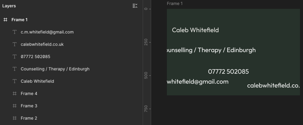
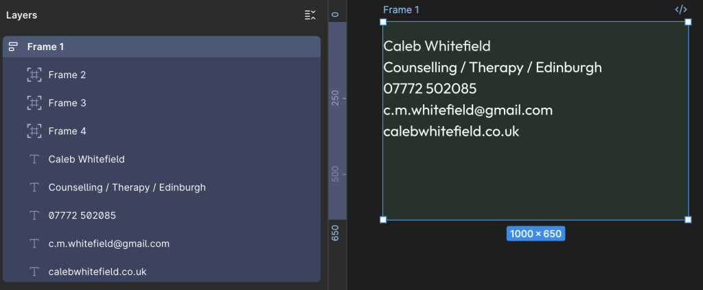
We have a customer who wants a business card to look like the following:

We can break this down into the following spec:
| Dimensions | 85 mm x 55mm |
| Resolution | 300 dpi |
| Font | Google Outfit |
| Colour 1 | Dark Green – 24332B |
| Colour 2 | Light Green – CDE5D9 |
| Colour 3 | Cream – F2F1ED |
| Text Row 1 | Caleb Whitefield |
| Text Row 2 | Counselling / Therapy / Edinburgh |
| Text Row 3 | 07772 502085 |
| Text Row 4 | c.m.whitefield@gmail.com |
| Text Row 5 | calebwhitefield.co.uk |
Getting Started in Figma
There are many, many tools we could use for this but, for the purpose of this example, we’re going to use Figma.
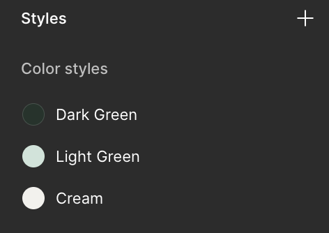
Create a New Colour Style
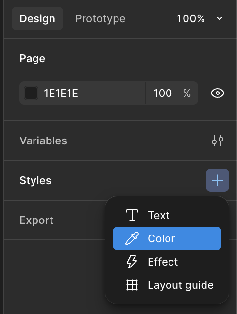
Starting with a New Draft, on the right-hand side of the screen, under the Design tab, locate the Styles section, and select the + icon:
Next, in the dropdown menu that appears, select Color (which should obviously be spelt Colour):
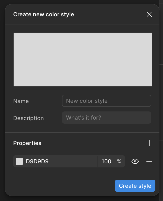
In the Create New Color Style menu that appears, you can enter a Name, a Description if you feel the need, and then click on the 6-character hexadecimal colour code (D9D9D9 by default).
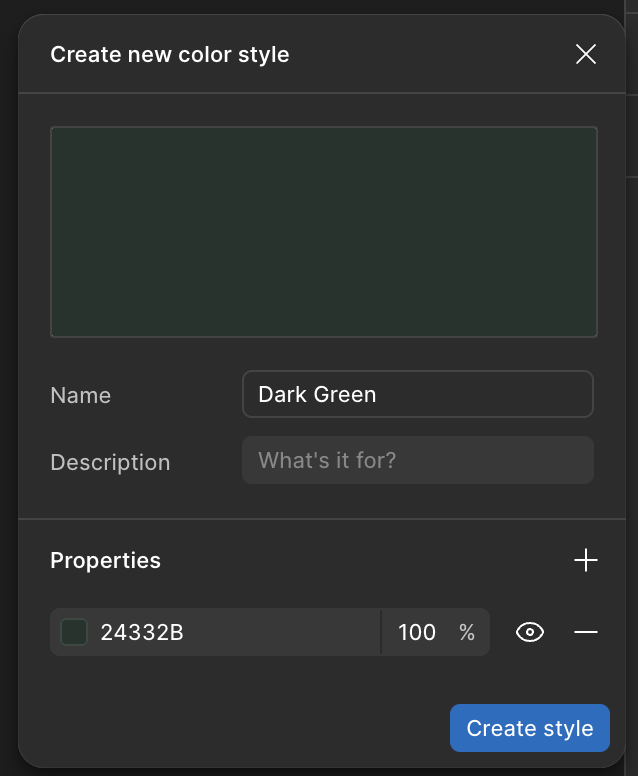
Let’s start with the Dark Green (24332B), then select Create Style:
Repeat until you have all three required colours:
Calculate Frame Size
The Business Card needs to be 85mm x 55mm at 300dpi (dots per inch).
Given that there are 25.4mm in one inch, we can use the following calculation to work out the size of the frame in pixels:
(300 dots per inch) / (25.4 mm per inch) x (85mm) = 1004 pixels
(300 dots per inch) / (25.4 mm per inch) x (55mm) = 649 pixels
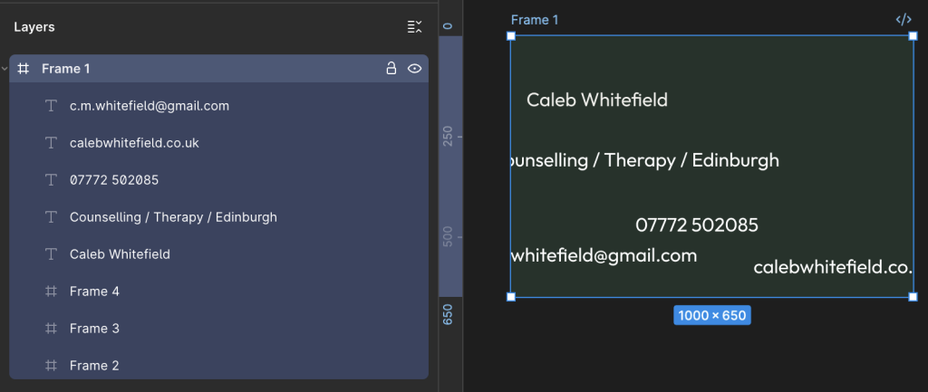
Let’s keep things simple and make the canvas 1000 x 650 pixels.
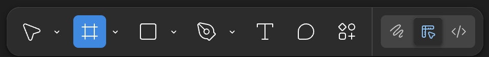
Insert a Frame
In the menu bar at the bottom of the screen, select the icon highlighted below in order to insert a Frame – alternatively, you can also use the keyboard shortcut of pressing the F key.
Either way, you want to see it highlighted as follows:
Now, simply click anywhere on the Page and you’ll see a 100 x 100 square appear.
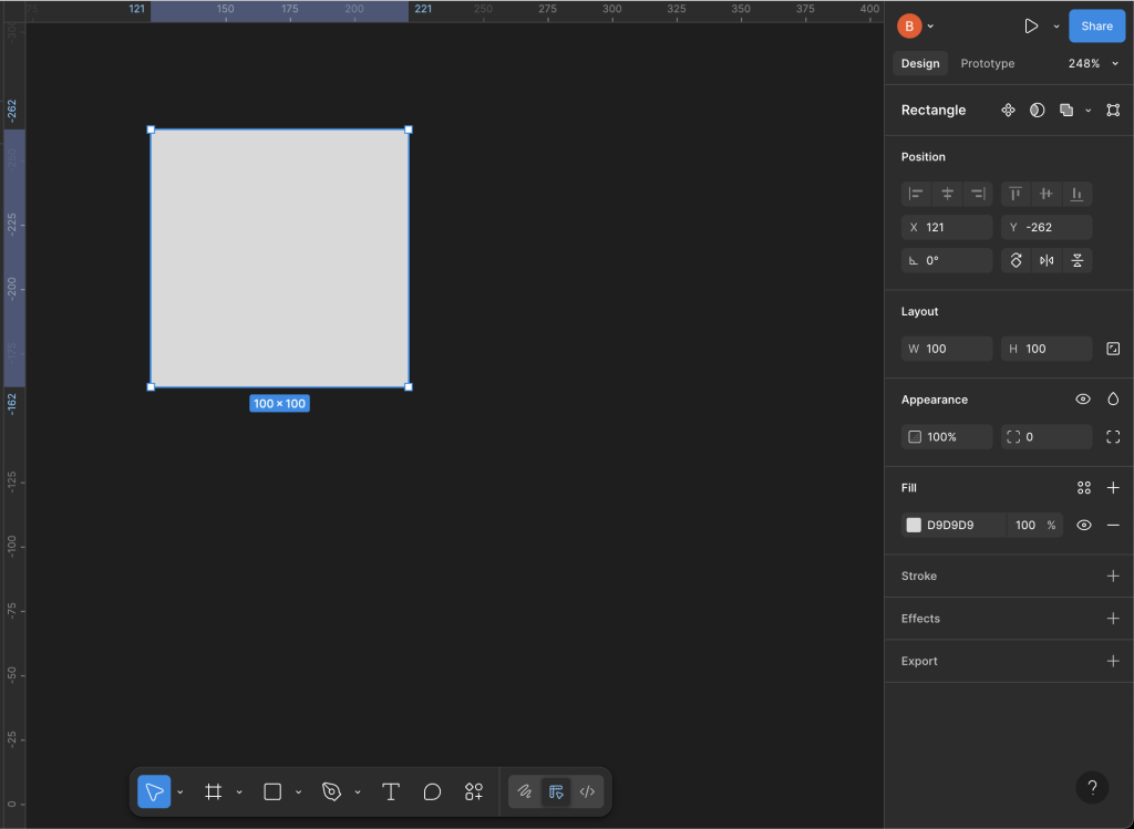
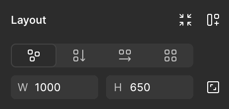
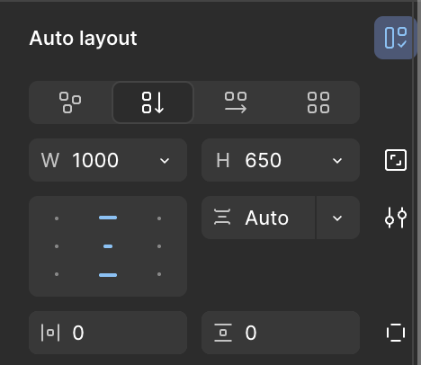
Over on the right-hand-side of the screen, set the Position and Layout to:
X = 0
Y = 0
W = 1000
H = 650
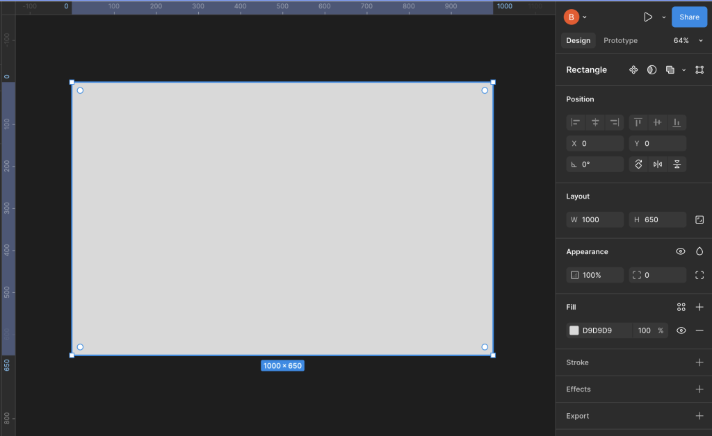
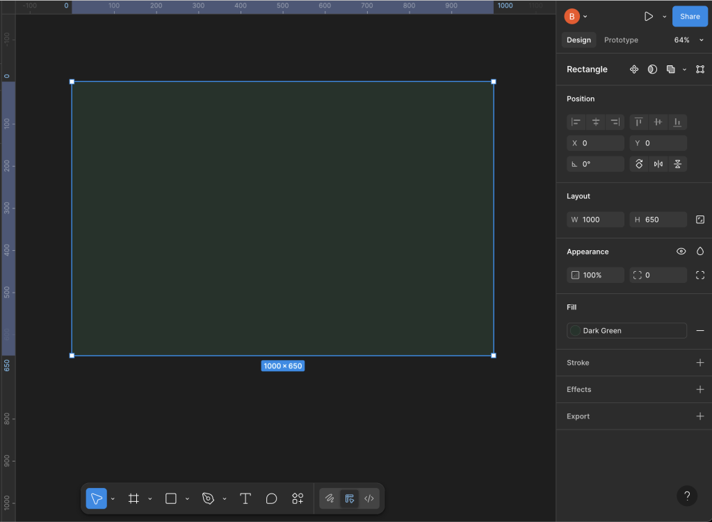
You may need to re-orient yourself on the background and possibly zoom in or out but, once you get your bearings, you should find that you have a layout something like this:
Fill the Frame with Colour
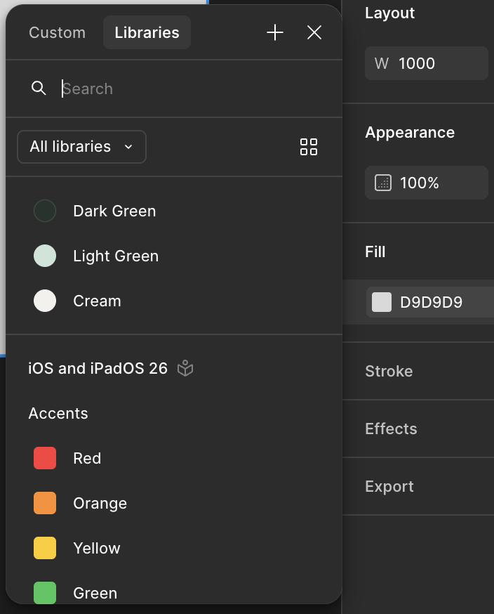
On the right-hand-side, in the Fill section, select the grey coloured box D9D9D9 (the hex code for 85% Grey or Gray85).
In the pop-up window that appears, select the Libraries tab to reveal the colours we created earlier, then select Dark Green:
Ta-da! Now we’re making progress:
Build the Layout
Now, let’s consider the information we want to include and the overall layout.
- Spacing
- Caleb Whitefield
- Counselling / Therapy / Edinburgh
- Spacing
- 07772 502085
- c.m.whitefield@gmail.com
- calebwhitefield.co.uk
- Spacing
Insert 3 x Spacing Frames
Let’s start by introducing the 3 spacing Frames.
Select the Frame icon on the toolbar at the bottom of the screen.
Now, select any point within the main Frame and you should see a result similar to the following:
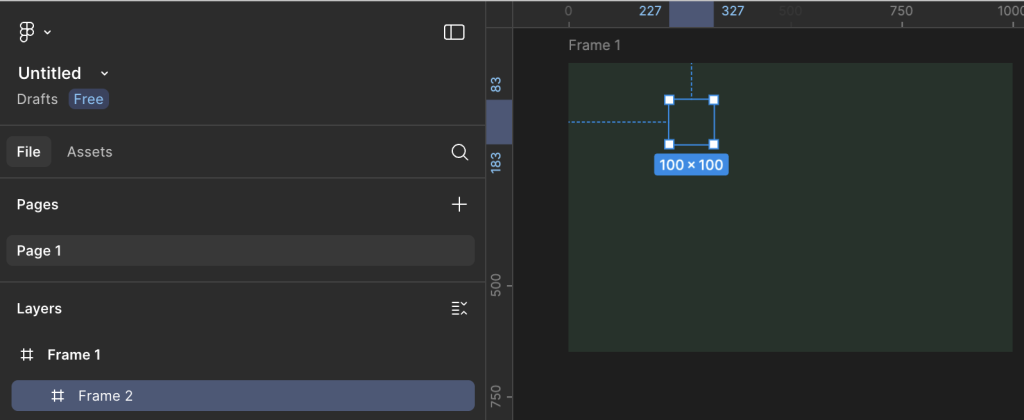
Hopefully, you should see the new Frame (Frame 2) nested below the original (Frame 1).
Repeat this process two more times to end up with something similar to the following:
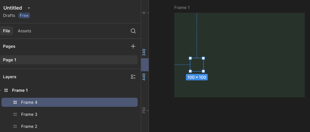
The important thing at this stage is that the three new Frames are nested under the first, main Frame; if necessary, you can drag and drop the Frames within the left-hand navigation bar.
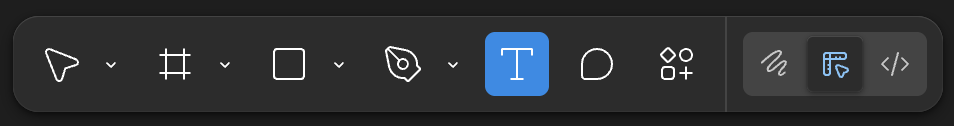
Insert Text
Select the Text icon from the toolbar at the bottom of the screen:
Note the Typography area that appears on the right-hand side of the screen and set the options as follows:
- Font = Outfit
- Fill = Cream
- Alignment = Align Center
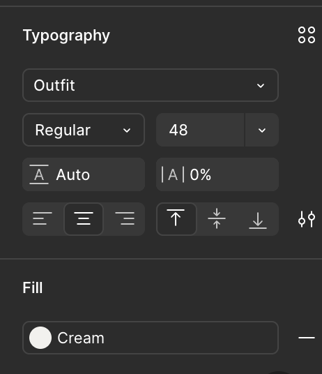
At this stage, it doesn’t matter too much about the Font Weight and the Font Size as we’ll tweak these later.
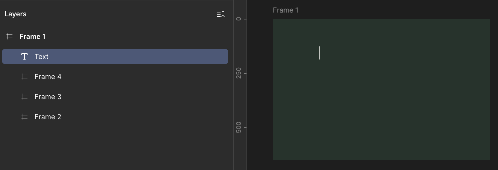
Making sure that the Text icon is still selected in the toolbar, select a point within the main Frame like we did earlier for the nested Frames.
You should see a Text layer appear in the area on the left-hand side of the screen and you should also see a cursor flashing in the spot where you added the Text layer inside the main Frame:
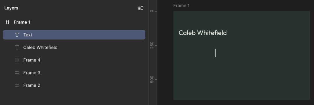
Now begin typing to enter the text, in this case “Caleb Whitefield”.
Now, click on the main Frame, away from the Text layer we just added, in order to insert another Text layer.
Try to avoid pressing the Enter key instead of clicking away from the Text layer because what this will do is to add another line of text to the layer we’re adding:
Enter the next bit of text (e.g. “Counselling / Therapy / Edinburgh”) and repeat for each of the Text layers until you have a total of 5.
It doesn’t matter too much at this stage about getting the text content correct. The main thing we are doing is creating all the required elements on the page.
It also doesn’t matter at this stage about the relative positioning of the Text layers, or indeed whether the text content spills over the edge of the Frame as we’ll address this shortly:
Auto Layout
In the left-hand menu area, select the main Frame so that it and the nested frames are highlighted:
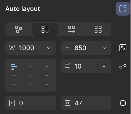
Now, over on the right-hand side of the screen, look for the Layout area and select the Vertical icon.
This will rename Layout to Auto Layout and the Alignment window will appear as below:
You should see the main Frame and its contents re-organise into something similar to the layout below:
Fill Container
In the Layers area on the left-hand side of the screen, select one of the Text layers such as “Caleb Whitefield” then, in the Design area on the right-hand side of the screen, locate the box with “W 1000” and select the dropdown arrow to its right, then select “Fill Container“:
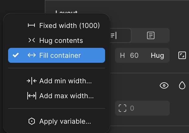
“Fill Container” means that the width of the Text layer should fill the full width of the Container, which in this case is the main Frame (the one we coloured in Dark Green earlier).
As a result, because we also earlier set the Text layer to Align Center, the content is now being centred relative to the overall width of the Frame.
Repeat this “Fill Container” process for each of the Text layers.
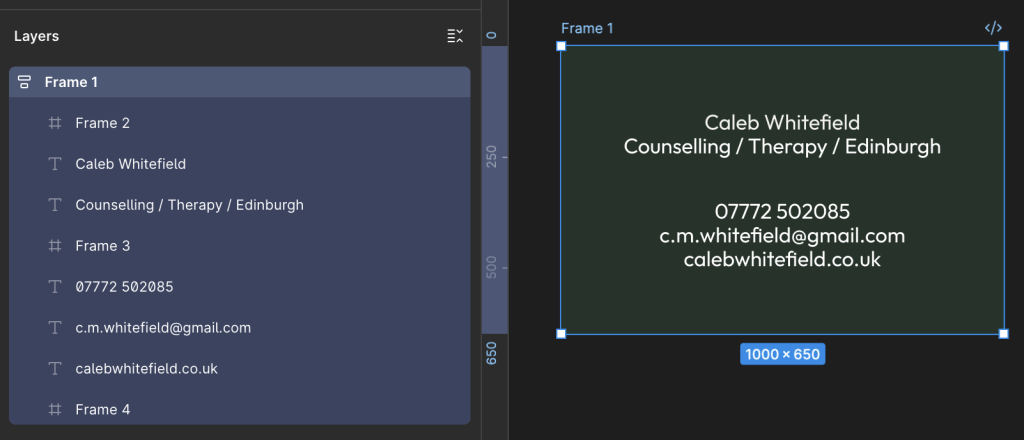
You should now have something similar to the following image:
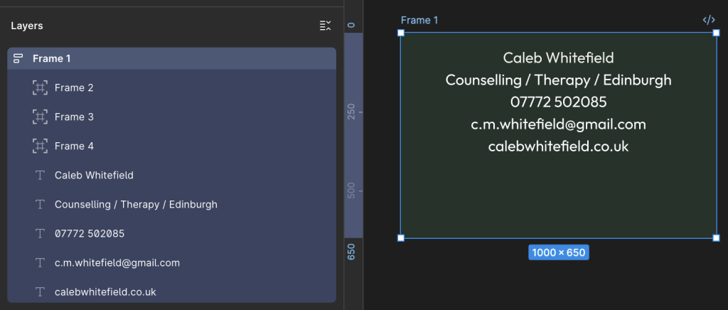
Let’s briefly recap on the main components:
- 5 x Text Layers, Center Aligned content.
- 3 x Spacing Layers.
What remains to be done:
- Correctly Order Spacing Frames and Text Layers.
- Set Font size and weight for Text Layers as desired.
- Tweak the overall layout as desired.
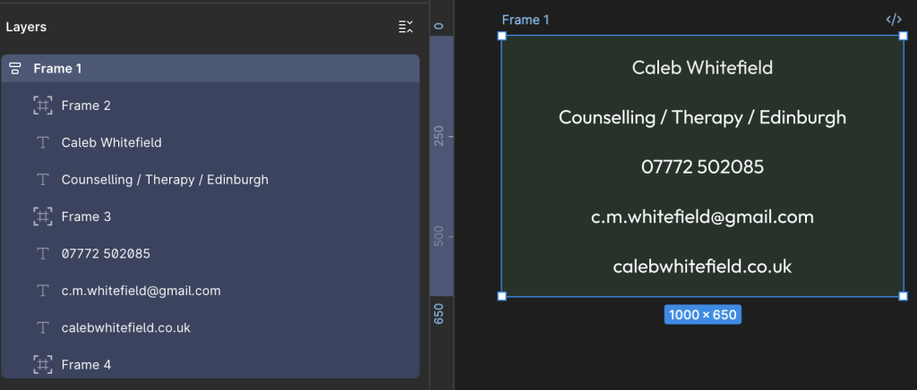
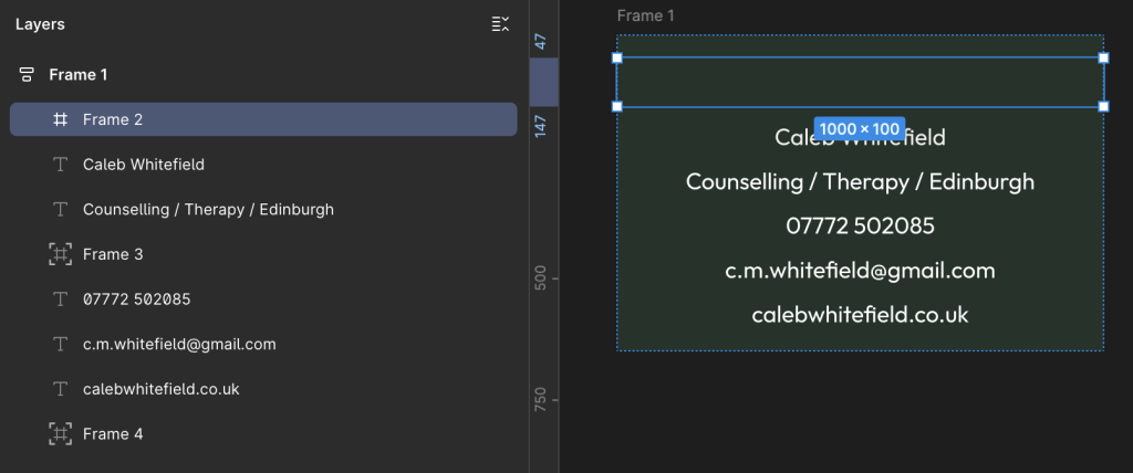
Re-Order the Spacing Frames and Text Layers
In the Layers area on the right-hand side of the screen, drag the Spacing Frames and the Text Layers into the order in the following image:
If you find that, as in the image above, the Spacing Frames are not being correctly displayed (or effectively ignored) in the layout, check the Design area on the right-hand side of the screen to make sure that the Position icon is not highlighted blue as below:
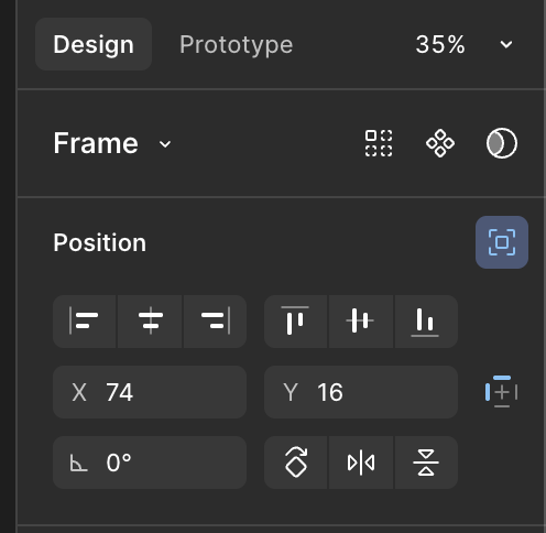
If this is the case then you will see that this is due to “Ignore Auto Layout” (displayed when you hover over the icon), in which case deselect this option:
As a result, you should now see the Spacing Frame appear and fill the full width of the Container.
Therefore, repeat this as necessary for the other Spacing Frames.
We can now see the main layout taking shape.
With the main Frame selected in the Layers area on the left-hand side of the screen (as above), review the Design area on the right-hand side of the screen (as below) to ensure that “Vertical Gap Between Objects” is set to Auto.:
Set Font Sizes for Text
For each of the Text Layers, select them and, in the right-hand Design area, locate the Typography section and select the Font Size and Weight as desired.
For example:
- Caleb Whitefield – Bold, 96
- Counselling / Therapy / Edinburgh – SemiBold, 48
- 07772 502085 – Regular, 48
- c.m.whitefield@gmail.com – Regular, 48
- calebwhitefield.co.uk – Regular, 48
You should now have an overall layout that looks like this:

Because there are so many different ways that we could have put the layout together (and perhaps you did), you may arrive at a final result that contains some subtle differences.
However, as long as you used the same overall approach, they should be small enough that a man on a galloping horse wouldn’t notice.
For the purposes of this tutorial, and for most real world applications, that’s good enough.
Export to PDF
In the Layout area on the right-hand side of the screen, select the main Frame to highlight the overall design.
Then, on the right-hand side of the screen, in the Design area, look at or scroll down to the bottom to reach the Export area. Click on the + to reveal the Export options, including the dropdown where you can select the format as PDF (or PNG, JPEG and SVG).
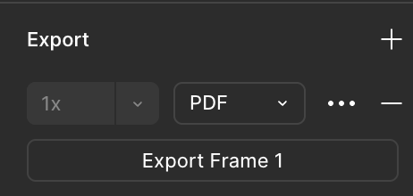
This will generate a file that you can print at 300dpi to produce an image of 85mm x 55mm as per the original requirement.
Job Done.
Leave a Reply