Exporting a WordPress database from a live server is straightforward — phpMyAdmin does it in a few clicks and hands you a .sql file.
What’s less obvious is that the file you get is tied to the server it came from, and you can’t just import it somewhere else and expect it to work.
Here’s what needed changing before the dump was usable locally, and why.
The URLs
WordPress stores the site’s URL in the database and references it throughout — in content, in settings, in serialised option values.
A database exported from calebwhitefield.co.uk has that domain baked in everywhere.
Importing it locally and visiting caleb-local.local would result in a site that tries to load assets, links, and resources from the live server.
The fix is a search-and-replace: swap every occurrence of the live URL for the local one.
Simple enough in principle, but in practice the URL appears in several different formats within the same file:
Plain: https://calebwhitefield.co.uk
HTTP variant: http://calebwhitefield.co.uk
Escaped for JSON: https:\/\/calebwhitefield.co.uk
Double-escaped (as MySQL stores it in string literals): https:\\/\\/calebwhitefield.co.uk
URL-encoded: https%3A%2F%2Fcalebwhitefield.co.uk
The double-escaped form is the one that catches people out.
When WordPress stores JSON in the database, it escapes the forward slashes.
MySQL then escapes the backslashes again when writing them to the export file.
The result looks different in the raw file from what it looks like in the database, and a simple find-and-replace will miss it.
All five formats needed replacing.
Miss one and you’ll have a site like I did, with mysterious broken references and no obvious error to diagnose.
The table prefix
WordPress uses a prefix on all its database table names — wp_commentmeta, wp_posts, and so on.
The prefix can be changed for any number of reasons, and this site’s live database was using a custom one (quietly applied automatically by the hosting provider) rather than the default wp_.
LocalWP uses wp_ by default, so the dump needed a prefix rename: 153 occurrences across table names, meta keys, and option names.
Straightforward, but also worth being precise about — not every occurrence of the old prefix in the file is necessarily a table name.
Host-specific tables
The live site runs on SiteGround, which installs its own database tables for caching and security logging.
These tables don’t exist in a standard WordPress installation and serve no purpose locally.
Removing them keeps the dump clean and avoids import errors on a fresh install.
Documenting what changed
A SQL dump is just a text file, and like any text file it can have comments.
I added a header block at the top documenting where the dump came from, what changes were made, and what it’s intended for.
That way, anyone (including future me) who picks up the file knows exactly what they’re looking at without having to reverse-engineer it.
The result
A .sql file that can be imported into any standard local WordPress installation and produce a working copy of the site.
No live server references, no host-specific cruft, no mystery.
Come to think of it, he’s my only customer but that’s not really the point.
What matters is that I built him a website and now we’re in a bit of a grey area around how to handle things.
This ‘grey area’ thing is probably worth a post in its own right but, for now, I’m more concerned with the fact that I just gave him WordPress Editor access – he effectively asked for it, and I didn’t know how to say ‘no’:
Or, more accurately, I didn’t know why I wanted to say ‘no’:
He didn’t specifically ask for WordPress Editor access. He’s probably never even used those words in a sentence before. I know I haven’t. But he did ask for the ability to make changes to the text on his website.
I built his website in WordPress. Whether that was a good idea remains to be seen, but it’s done now so that’s what we have to work with.
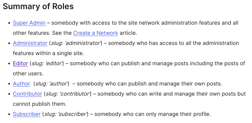
Step One – RTFM
I asked Google for “wordpress roles”.
I had to wade through more than a page of Sponsored Results before I got to the official WordPress.org documentation.
Or, to put it another way, I had to shrink my screen to 66% of its normal resolution before the desired and, surely, objectively, the best result would be displayed.
If I didn’t know that I was looking for official WordPress documentation, I would have been led down all sorts of rabbit holes. I don’t know. Maybe this was just bad luck, but that’s the first time that I’ve felt comprehensively let down by Google.
I landed on Editor as being the appropriate level of access, given that it was me (another user) who had created the original Pages that Caleb would be editing or, more accurately, “publishing and managing”.
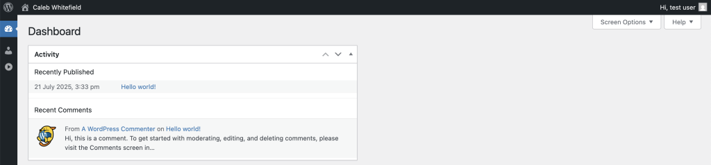
The documentation refers to Posts rather than Pages (I’m still not quite clear on the technical difference) so I created a test user to try it out (WordPress Dashboard -> Users -> Add User).
Once set up, I could then log in to the WordPress Editor as the new Editor user, albeit with a much more limited Dashboard than I was expecting…
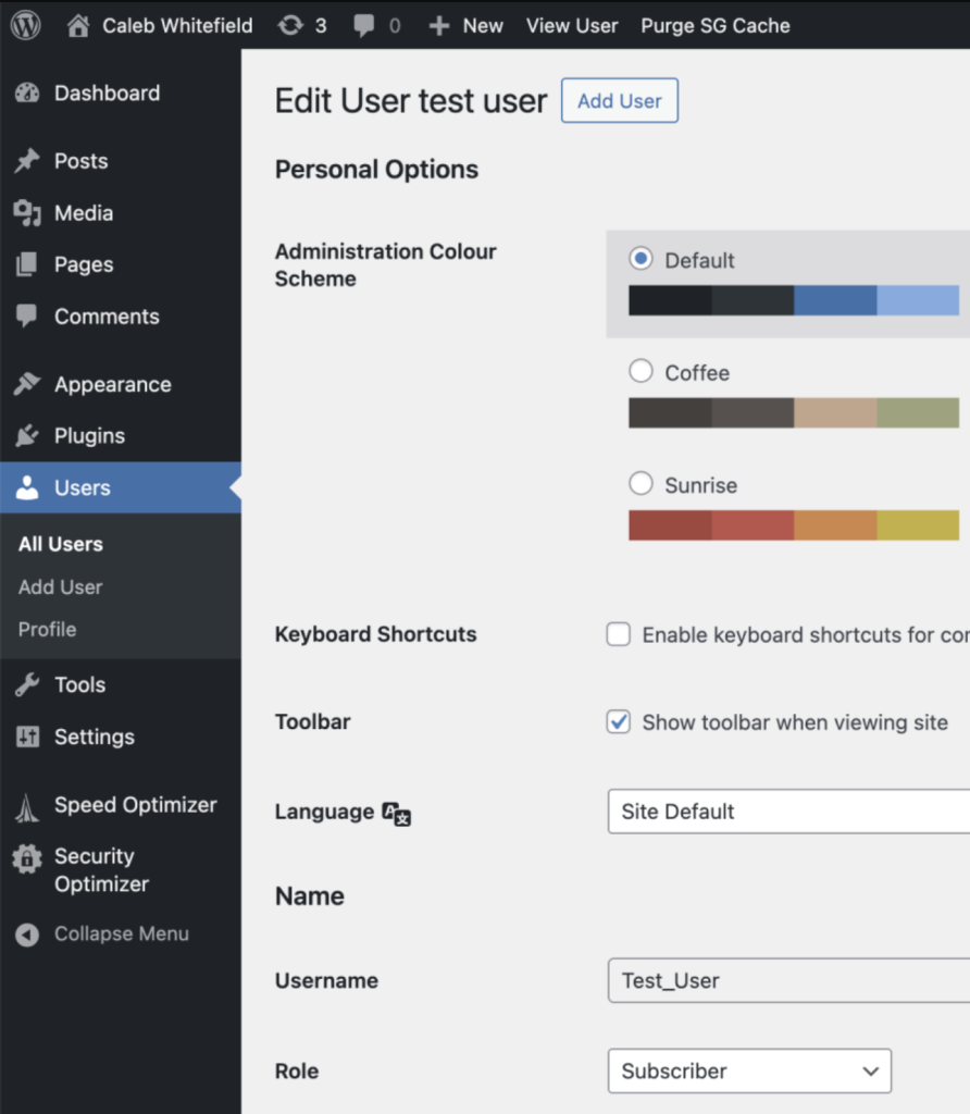
When I logged in to the WordPress Dashboard with my admin user, I could see that I’d made a mistake where test user was set to be only a Subscriber:
This was soon corrected by using the dropdown to select “Editor” and clicking “Update User”.
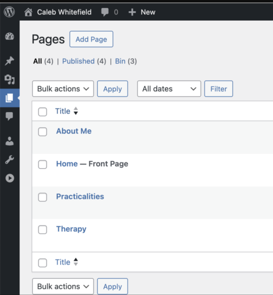
Now, sure enough, when I log in to the WordPress Dashboard as the test user, I can see all the available Pages that I created as the Admin user:
When I click to Edit one of the Pages, I get taken to the Block Editor and can make and save changes.
Right. That’s the POC done.
I then repeated the steps to give Caleb his own dedicated user:
One thing that this now highlights is that I haven’t yet set him up with his own dedicated email address on his domain. The main reason I haven’t done that is because he doesn’t know how to set up a new email account in his email client on his laptop and phone, and so I also need to prepare some notes for him on how to do that.
What’s slowly becoming apparent here is that I need a decent workflow for all of this. Assuming I make a habit of this, any new client should get
1) a personal email address associated with their domain
2) a WordPress login ID associated with that personal email address
3) instructions on how to make use of these new accounts
I suppose what I’m describing here is a sort of onboarding process.
Alright. So I gave my customer WordPress Editor access. Fine. But was it a good idea…?
For this, it’s important to get a couple of things out of the way.
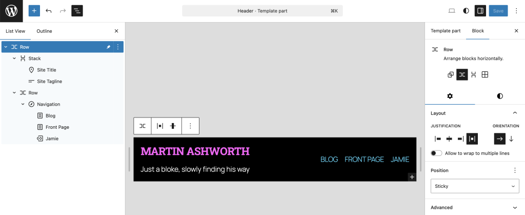
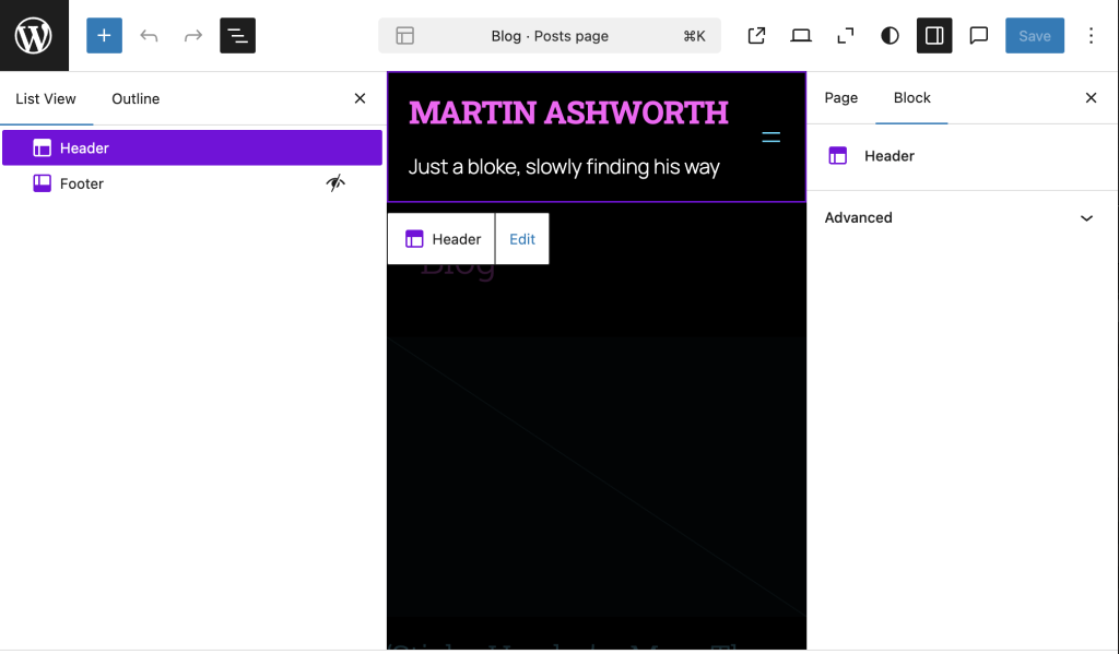
In WordPress, a Header is a Pattern, which is one of the component parts used to build Pages.
Given that framework, I assumed that a Header would be tagged with the Sticky attribute which would then apply wherever the Header was used.
Once again, I was wrong.
A Header is indeed a reusable component part, but the Header itself is not simply Sticky or not – the Sticky attribute has a bit more nuance.
In my case, the Header component Pattern contains a Row, which then contains a Stack on the left and Navigation Row on the right. I wasn’t really sure where to start so I tagged the Row as ‘Sticky’, basically because this was at the top of the hierarchy:
It was a nice try but it didn’t work:
Let’s think about this a bit more deeply; I only really tagged the Row as Sticky, and I did this within the context of the Header. Arguably, the Row might well have had the Sticky attribute correctly applied within the context of the Header, but the Header itself sits within the overall Page, and it’s the Page that I’m asking to scroll. And the page is, indeed, scrolling.
I’m obviously missing something. When in doubt, RTFM.
For some reason, I’ve been having trouble locating the relevant part of the documentation for this (almost certainly due to user error), but this video is a very good place to start.
For now, I’ll just highlight the four stated learning outcomes:
Wrapping your header in a Group block.
Allocating and selecting the sticky option.
Changing the background of the Group block to ensure the header is not transparent.
Previewing the sticky header or banner in the Block Editor.
That’s why I was having trouble finding the information for it. I was treating the Header as a thing that should have a property like that, because I was thinking of the Header as a Block. But the Header is a Pattern.
For the sake of completeness, I’m going to disable the Sticky property that I earlier enabled on the Row of the Header Pattern. It wasn’t serving a purpose and I don’t like to leave random settings lying around to trip me up later.
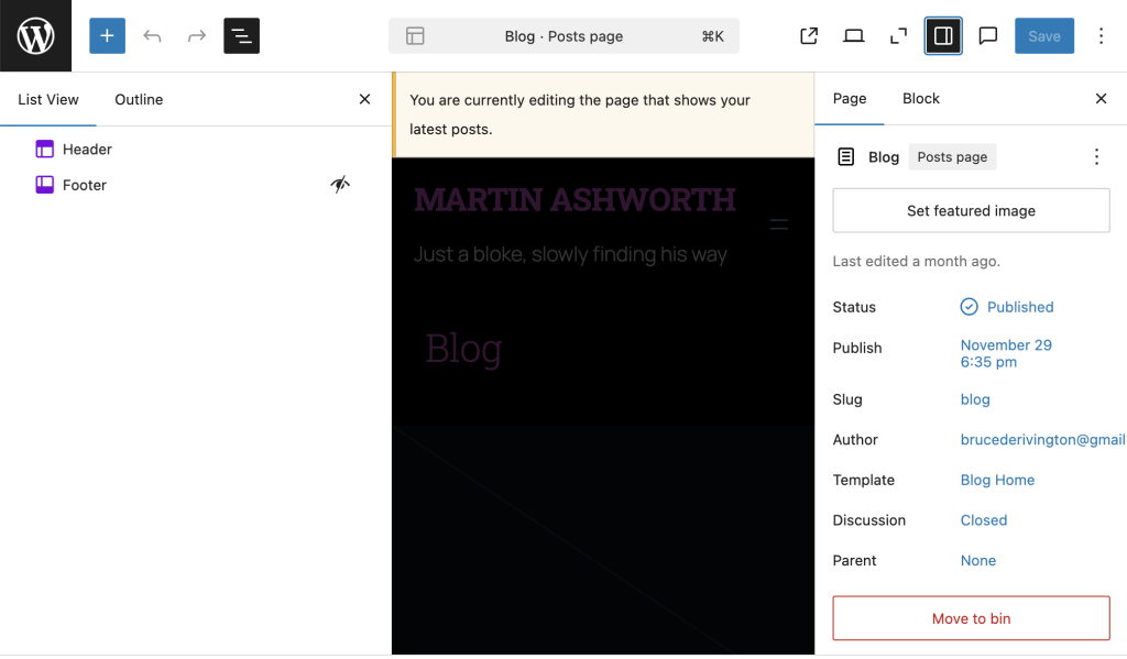
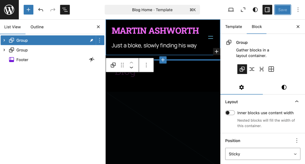
For my Front Page, it currently doesn’t scroll anyway, so making changes there is redundant. The only other actual Page is the Blog Page which only has the option to modify Header and Footer settings:
That’s because it’s using the Blog Home Template:
So… do I want to change the Blog Page definition or the Blog Page Template?
I’ll try them one at a time and see what happens.
Blog Page definition:
Nope. The only modifications I can make to the Header Pattern via the Blog Page definition leads me to Edit the Header Pattern, and we’ve already been down that cul de sac.
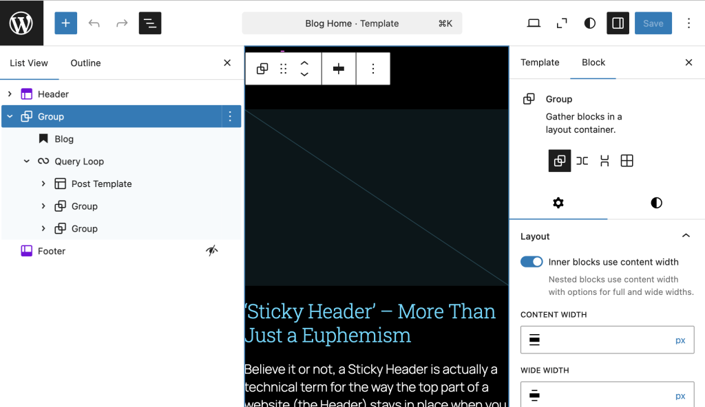
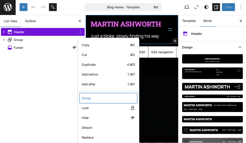
OK. So that leaves the Blog Home Template:
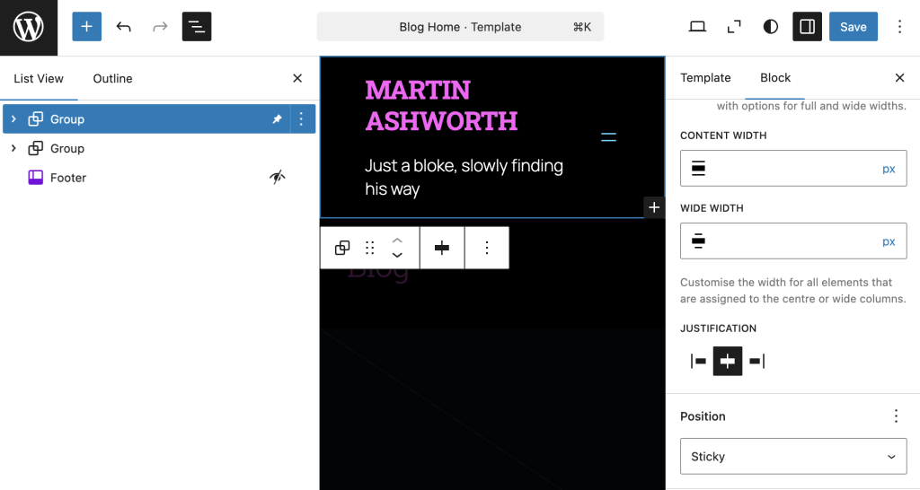
Here, I do indeed have the option to place the Header into a Group. Good. Now let’s make it Sticky:
OK. And now for the big moment. When I scroll on the Blog Home Page, does the Header move or stay put?
Well. I think I’ll call that a partial success.
Yes, the Header stays put, so it is Sticky.
We have two new problems:
The Header is much narrower than it was.
The Header is transparent so the rest of the page is visible as it scrolls past.
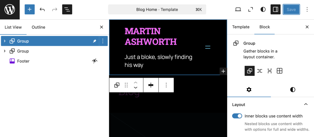
The newly narrow Header is caused by the new Group having a default setting of “Inner Blocks Use Content Width”:
The quick fix is to disable this option. The reasons for why this was having an impact are part of a bigger topic that deserves its own investigation and Post. All the same, I’ll just confirm that I’ve disabled this option:
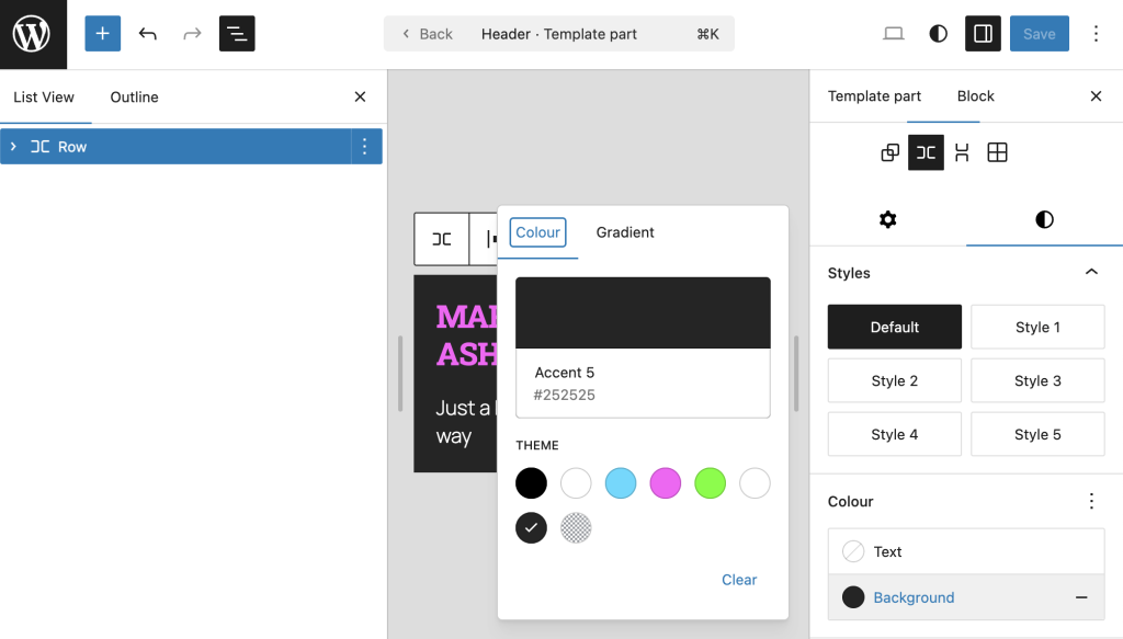
Nearly there. That’s the Sticky Header in place, but the remanining problem is that the main body content is visible when it scrolls past the Header.
This can be addressed by setting the background of the Header to be black:
OK. It’s not perfect. Now that the Header is Sticky, I can’t help but feel as though the content of the main page just sort of disappears when it reaches the Header. I start to notice how other sites have some sort of division between the Header and the main body and content, or maybe the Header has some sort of texture or overlay. I don’t know. I’ll need to sleep on it and pay attention to other sites. Today’s goal was only to make the Header Sticky. That’s a bingo.
A Sticky Header is actually a technical term for the way the top part of a website (the Header) stays in place when you scroll down the page.
You’ve no doubt seen one before, but whether you actually appreciated it (let alone cared) is another matter.
Perhaps the main benefit of a Sticky Header is that, once you’ve scrolled down the page for a bit, when you want to navigate to another part of the website, then the menu is just there at the top, ready and waiting. After all, who wants to read all the way through a web page only to have to scroll all the way back up to the top once you’ve finished?
I sort of assumed that all Headers were sticky, that the top of every website just stayed put when I scrolled. Apparently not…
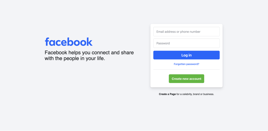
Unfortunately, Facebook presents a landing page which requires credentials that I don’t have (and don’t want) so I’m afraid that was a bit of a false start. Sorry. I guess that goes down as 0/1.
Facebook Front Page
Amazon
Fortunately, I had no such trouble with Amazon. However, much to my surprise, the Header here is ‘Default’ in that it scrolls with the rest of the page, rather than staying put. Well, I never… 0/2.
Amazon Default Header Scroll
Apple
With Apple, it was third time lucky and I can finally see a real-life functioning Sticky Header.
Apple Home Page Sticky Header
That was harder work than I expected. 1/3.
And it turns out that, even now that I’ve found one, I only need to follow Apple’s Header Menu as far as the Store option to find that the Header switches back to being Default:
Apple Store Header Default
FFS. I don’t even know how to keep score for this anymore.
Netflix
So what about Netflix?
Another Default one! Bloody hell! Sticky Headers appear to be the exception rather than the rule. How is that even possible?
Google
And Google?
Well, by now I probably shouldn’t be surprised, but Google seem to have a one-of-a-kind-custom-header-thing going on.
More Questions Than Answers
After all that, I’m not entirely sure what I learnt.
I’m left wondering how I ever got the impression that Sticky Headers were so prevalent.
I’d like to know whether they behave the same way on Mobile because that’s where I first thought that they were particularly useful (if not indispensible) – i.e. to quickly access the Navigation Menu without needing to scroll all the way back to the top.
I can see the benefits of having more screen space when the Header disappears, particularly on Mobile. However, this runs counter to my preference for retaining the Sticky Header on Mobile.
I half-noticed that the Amazon Header had what seemed to be non-standard (or maybe even unique) behaviour in that it seemed to re-appear as soon as I started to scroll up. On reflection, this seems like a genius idea and elegantly resolves the conflict between points 2. and 3.
How are all these things implemented? It’s all very well having an on-off button for whether a Header is Sticky or not but how is the subtlety introduced and managed? Clearly, I still have a lot to learn.
What Would Dave Do?
When in doubt, the bloke with the answers for all things internet is usually my brother, Dave.
It turns out that Dave’s Header goes transparent on scroll, which is yet another approach that I hadn’t considered. Furthermore, I have no idea how he did it. I’ll have to ask him.
My goodness, this was a real can of worms, wasn’t it?
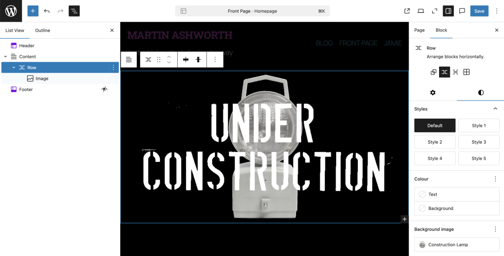
The main image on my Front Page is composed of two parts; there’s the lamp and the text, then the two are layered to make a composite.
The two individual images originally came from a convoluted and painful conversation with the AI chatbot, Grok. Save yourself the grief of wading through the chat and trust me that the pertinent points are as follows:
I was (and still am) very much figuring out the design and mechanics of my website one step at a time. I wanted to reference the old-skool “Under Construction” gifs that I used to see on sites in the early days of the internet, but to somehow bring it a bit more up-to-date.
I had a rough mental image of the lamp and the wording and so I tasked Grok with generating them. It didn’t go to plan, but it did at least lead me to do a Google seach to find an image of a lamp that was leaning in the right direction:
Maxilite Lamp
I wanted to remove the branding, the colour and the background. Grok made short work of removing the branding…
Maxilite Lamp Without Branding
…and then the colour:
Maxilite Lamp with branding and colour removed
I could have done both of these things manually with graphics software, but it just was quicker and easier to delegate it.
However, that gain was soon eroded, if not offset, when it struggled with removing the background. I could go on about how tiresome and tedious the exchange with Grok was, and maybe it would have been easier had I given better or clearer instructions, but the end result was that I decided to just step in and manually clean up the mess.
Fortunately, I have rudimentary graphic design skills that are good enough to find my way around a tool such as Procreate, the amazing value iPad app. As an aside, I subscribe to the view that it is worth it to buy an iPad just to use Procreate.
Having sorted the background image, it was time for the text. I asked Grok to “Give me the words “UNDER CONSTRUCTION” on two rows, one word on each row, using a font that looks like it has been stamped.”
Under Construction AI First Draft
I’d say it did a decent job, although it’s worth noting that I didn’t ask for what might charitably be described as the ‘context’ for the text. I specifically wanted the text and only the text. I could have probably refined my prompt to home in on this but I was pretty sure that it would be quicker and simpler to isolate the text myself.
Graphic design tools encourage a person to think in terms of things like layers and selections, which lend themselves well to this situation. In this case, I decided to pick the image on the right because I favoured the text being straight-on.
Then I cropped the image to remove the background.
Next, I selected the background area and set the threshold to be just high enough to capture most of the ‘white’ area. Then, by inverting the selection, I could effectively isolate the black text, and copy and paste it onto a new layer.
To finally cobble together the composite, I basically crow-barred the two images into any sort of combination that seemed to work. As I recall, it took a few attempts to get the two images to play together nicely, especially when I switched to view them on Mobile.
After the fact, I now find that I settled on a Row with a Background Image (the lamp), where the Row contains an Image (the text).
I’d be surprised if this was the optimal way to achieve this effect and I genuinely look forward to being more fluent in the mechanics of layout to be able to think about this more clearly but, at this stage, I’m aiming for progress, not perfection.
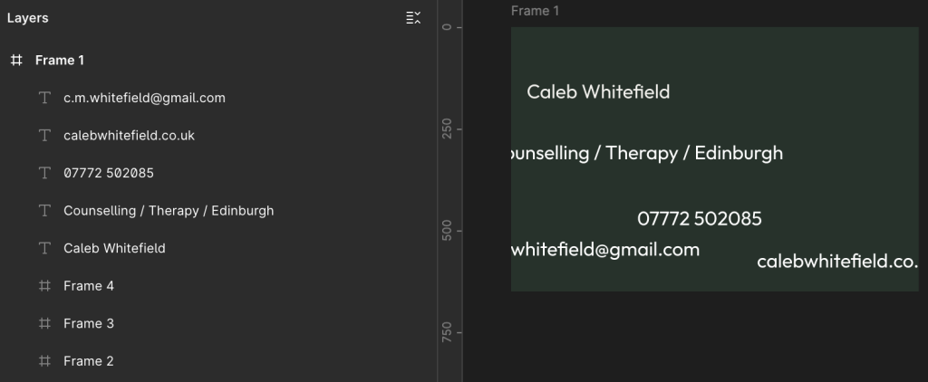
We have a customer who wants a business card to look like the following:
We can break this down into the following spec:
Dimensions
85 mm x 55mm
Resolution
300 dpi
Font
Google Outfit
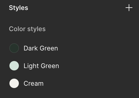
Colour 1
Dark Green – 24332B
Colour 2
Light Green – CDE5D9
Colour 3
Cream – F2F1ED
Text Row 1
Caleb Whitefield
Text Row 2
Counselling / Therapy / Edinburgh
Text Row 3
07772 502085
Text Row 4
c.m.whitefield@gmail.com
Text Row 5
calebwhitefield.co.uk
Getting Started in Figma
There are many, many tools we could use for this but, for the purpose of this example, we’re going to use Figma.
Create a New Colour Style
Starting with a New Draft, on the right-hand side of the screen, under the Design tab, locate the Styles section, and select the + icon:
Next, in the dropdown menu that appears, select Color (which should obviously be spelt Colour):
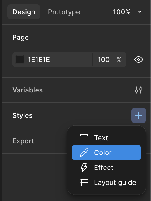
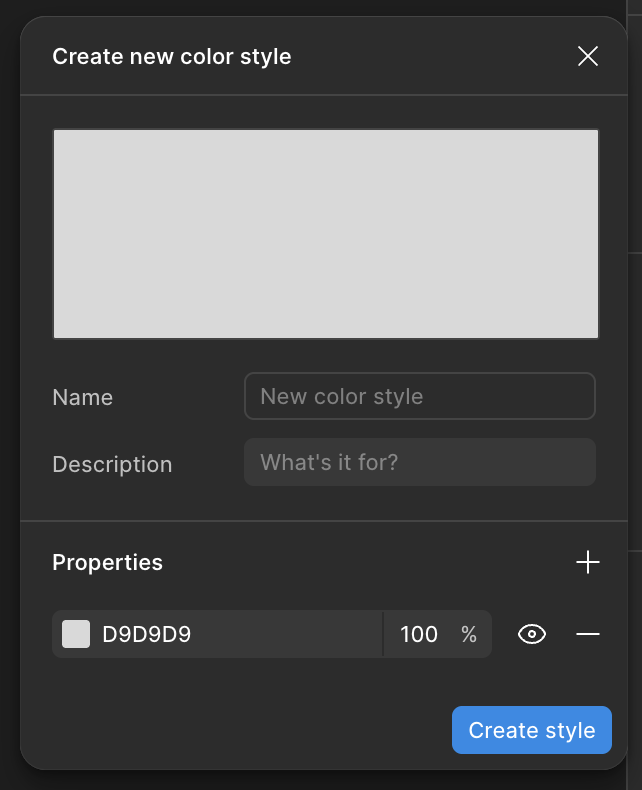
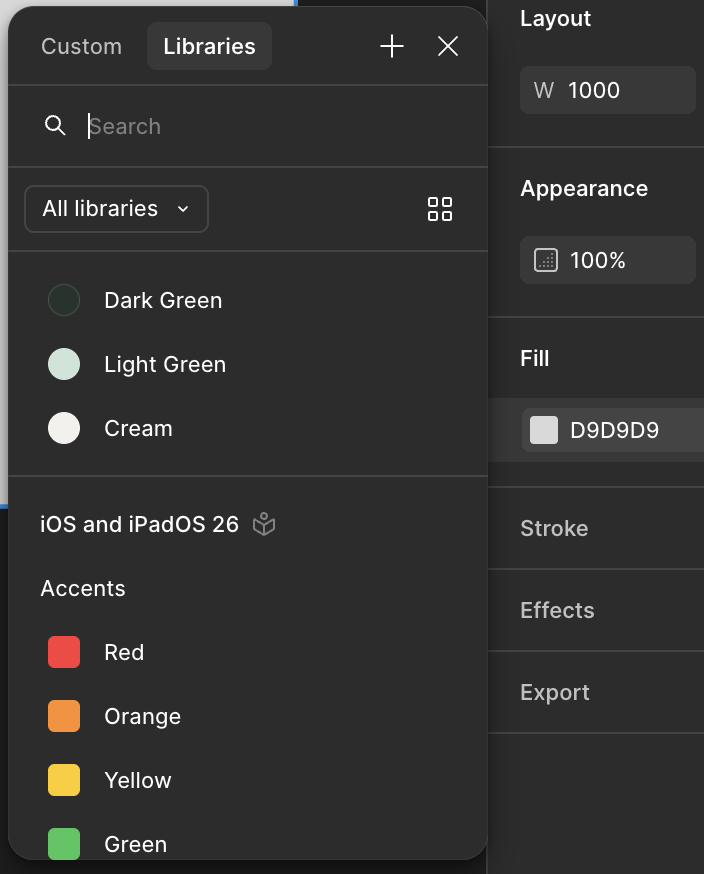
In the Create New Color Style menu that appears, you can enter a Name, a Description if you feel the need, and then click on the 6-character hexadecimal colour code (D9D9D9 by default).
Let’s start with the Dark Green (24332B), then select Create Style:
Repeat until you have all three required colours:
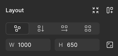
Calculate Frame Size
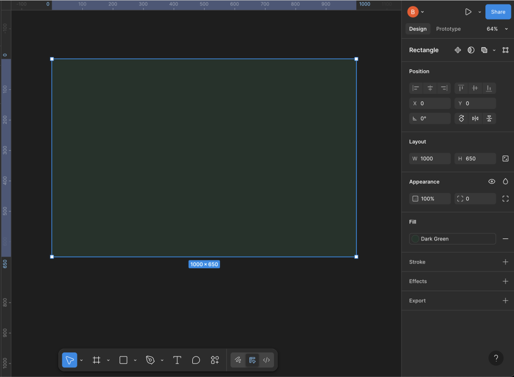
The Business Card needs to be 85mm x 55mm at 300dpi (dots per inch).
Given that there are 25.4mm in one inch, we can use the following calculation to work out the size of the frame in pixels:
(300 dots per inch) / (25.4 mm per inch) x (85mm) = 1004 pixels
(300 dots per inch) / (25.4 mm per inch) x (55mm) = 649 pixels
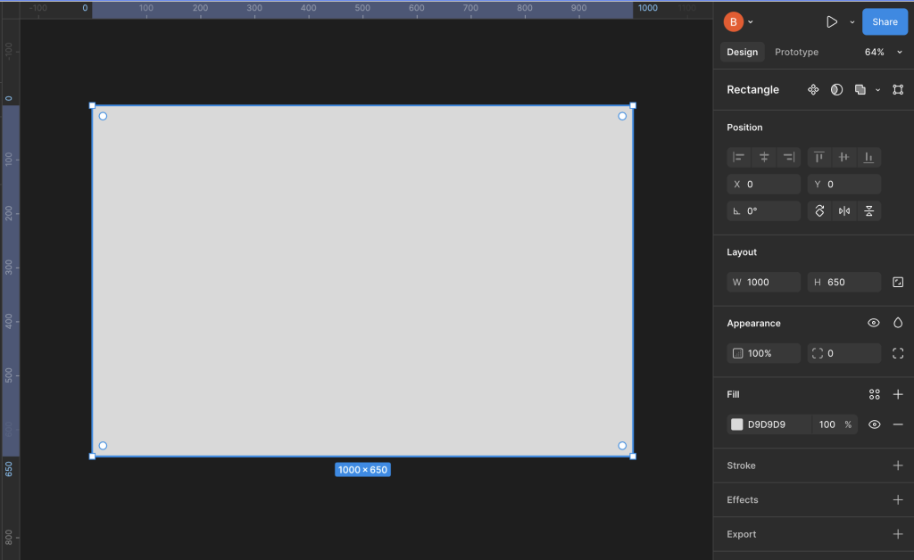
Let’s keep things simple and make the canvas 1000 x 650 pixels.
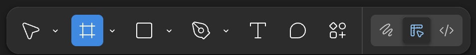
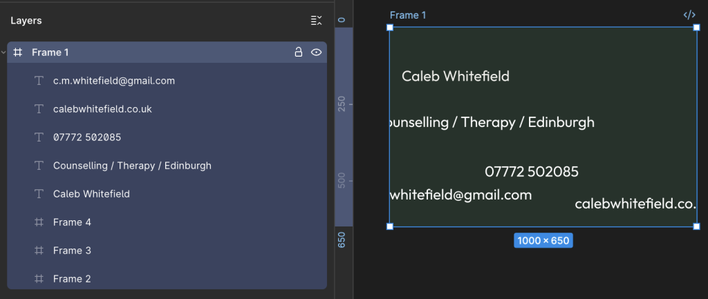
Insert a Frame
In the menu bar at the bottom of the screen, select the icon highlighted below in order to insert a Frame – alternatively, you can also use the keyboard shortcut of pressing the F key.
Either way, you want to see it highlighted as follows:
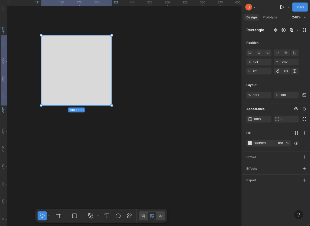
Now, simply click anywhere on the Page and you’ll see a 100 x 100 square appear.
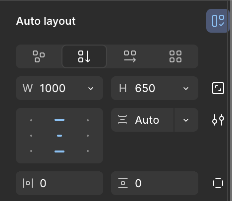
Over on the right-hand-side of the screen, set the Position and Layout to:
X = 0
Y = 0
W = 1000
H = 650
You may need to re-orient yourself on the background and possibly zoom in or out but, once you get your bearings, you should find that you have a layout something like this:
Fill the Frame with Colour
On the right-hand-side, in the Fill section, select the grey coloured box D9D9D9 (the hex code for 85% Grey or Gray85).
In the pop-up window that appears, select the Libraries tab to reveal the colours we created earlier, then select Dark Green:
Ta-da! Now we’re making progress:
Build the Layout
Now, let’s consider the information we want to include and the overall layout.
Spacing
Caleb Whitefield
Counselling / Therapy / Edinburgh
Spacing
07772 502085
c.m.whitefield@gmail.com
calebwhitefield.co.uk
Spacing
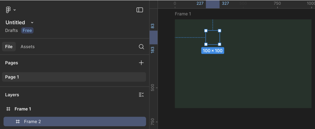
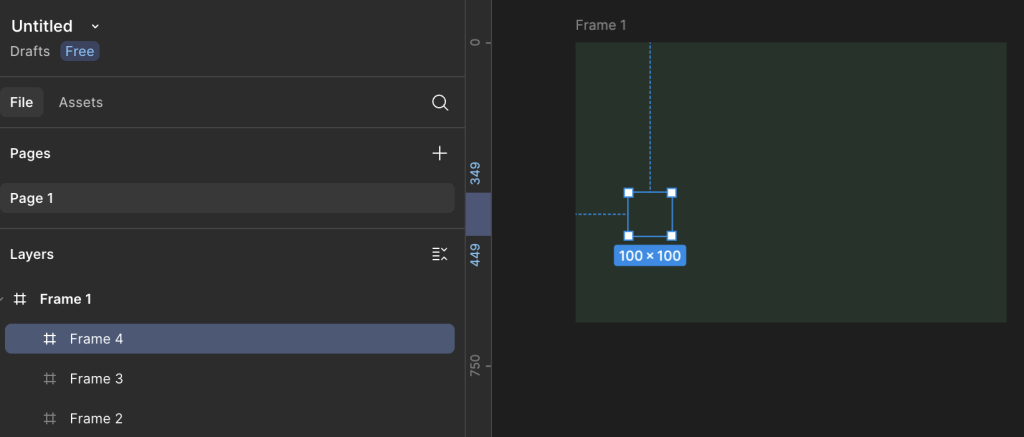
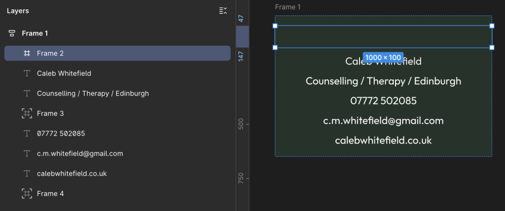
Insert 3 x Spacing Frames
Let’s start by introducing the 3 spacing Frames.
Select the Frame icon on the toolbar at the bottom of the screen.
Now, select any point within the main Frame and you should see a result similar to the following:
Hopefully, you should see the new Frame (Frame 2) nested below the original (Frame 1).
Repeat this process two more times to end up with something similar to the following:
The important thing at this stage is that the three new Frames are nested under the first, main Frame; if necessary, you can drag and drop the Frames within the left-hand navigation bar.
Insert Text
Select the Text icon from the toolbar at the bottom of the screen:
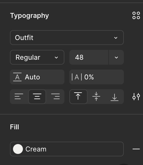
Note the Typography area that appears on the right-hand side of the screen and set the options as follows:
Font = Outfit
Fill = Cream
Alignment = Align Center
At this stage, it doesn’t matter too much about the Font Weight and the Font Size as we’ll tweak these later.
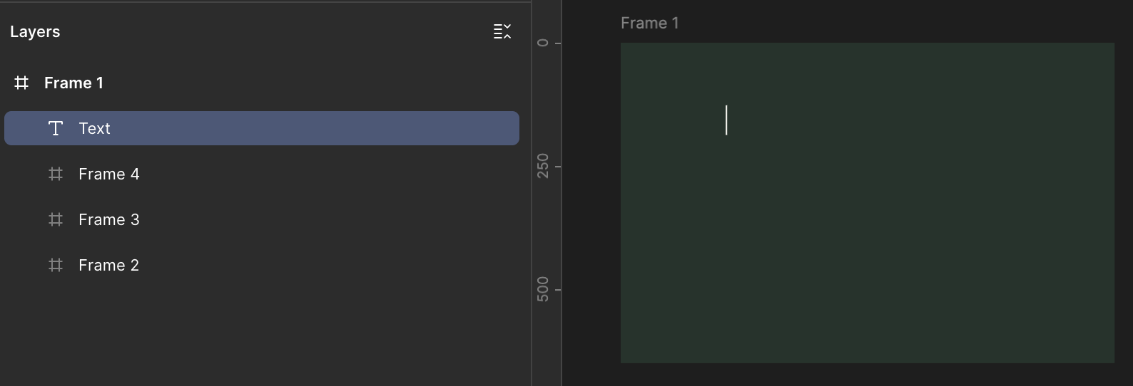
Making sure that the Text icon is still selected in the toolbar, select a point within the main Frame like we did earlier for the nested Frames.
You should see a Text layer appear in the area on the left-hand side of the screen and you should also see a cursor flashing in the spot where you added the Text layer inside the main Frame:
Now begin typing to enter the text, in this case “Caleb Whitefield”.
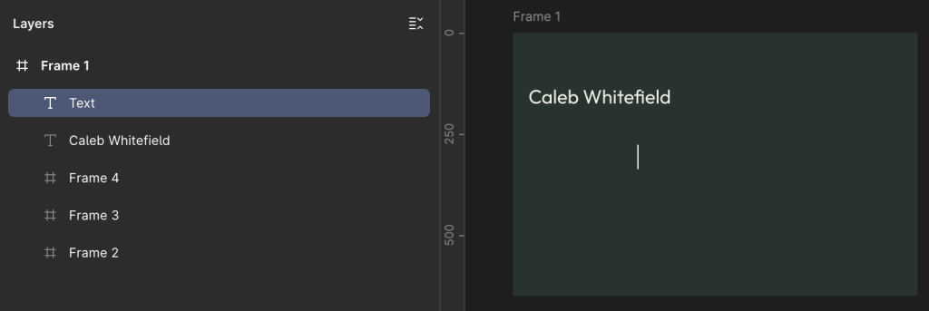
Now, click on the main Frame, away from the Text layer we just added, in order to insert another Text layer.
Try to avoid pressing the Enter key instead of clicking away from the Text layer because what this will do is to add another line of text to the layer we’re adding:
Enter the next bit of text (e.g. “Counselling / Therapy / Edinburgh”) and repeat for each of the Text layers until you have a total of 5.
It doesn’t matter too much at this stage about getting the text content correct. The main thing we are doing is creating all the required elements on the page.
It also doesn’t matter at this stage about the relative positioning of the Text layers, or indeed whether the text content spills over the edge of the Frame as we’ll address this shortly:
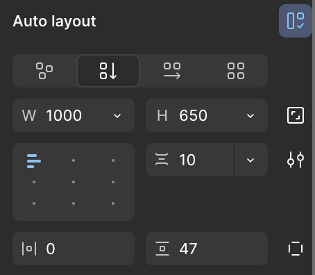
Auto Layout
In the left-hand menu area, select the main Frame so that it and the nested frames are highlighted:
Now, over on the right-hand side of the screen, look for the Layout area and select the Vertical icon.
This will rename Layout to Auto Layout and the Alignment window will appear as below:
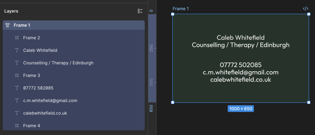
You should see the main Frame and its contents re-organise into something similar to the layout below:
Fill Container
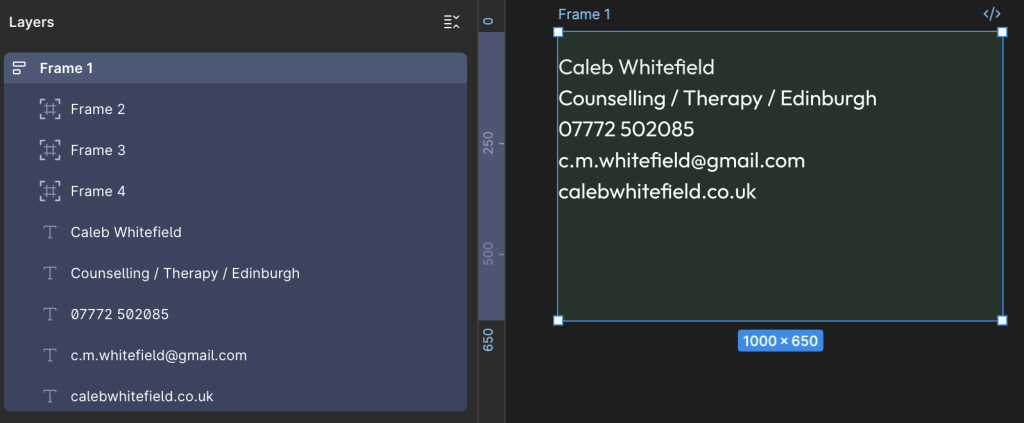
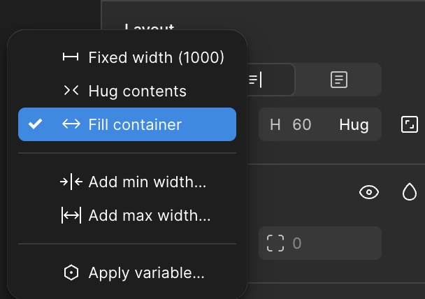
In the Layers area on the left-hand side of the screen, select one of the Text layers such as “Caleb Whitefield” then, in the Design area on the right-hand side of the screen, locate the box with “W 1000” and select the dropdown arrow to its right, then select “Fill Container“:
“Fill Container” means that the width of the Text layer should fill the full width of the Container, which in this case is the main Frame (the one we coloured in Dark Green earlier).
As a result, because we also earlier set the Text layer to Align Center, the content is now being centred relative to the overall width of the Frame.
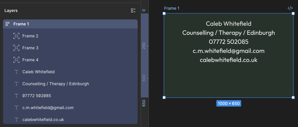
Repeat this “Fill Container” process for each of the Text layers.
You should now have something similar to the following image:
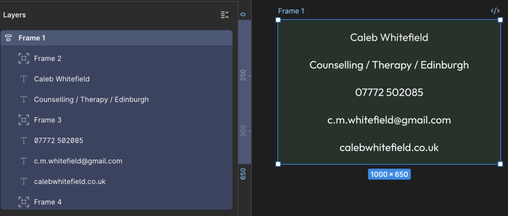
Let’s briefly recap on the main components:
5 x Text Layers, Center Aligned content.
3 x Spacing Layers.
What remains to be done:
Correctly Order Spacing Frames and Text Layers.
Set Font size and weight for Text Layers as desired.
Tweak the overall layout as desired.
Re-Order the Spacing Frames and Text Layers
In the Layers area on the right-hand side of the screen, drag the Spacing Frames and the Text Layers into the order in the following image:
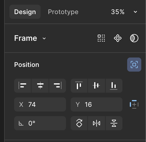
If you find that, as in the image above, the Spacing Frames are not being correctly displayed (or effectively ignored) in the layout, check the Design area on the right-hand side of the screen to make sure that the Position icon is not highlighted blue as below:
If this is the case then you will see that this is due to “Ignore Auto Layout” (displayed when you hover over the icon), in which case deselect this option:
As a result, you should now see the Spacing Frame appear and fill the full width of the Container.
Therefore, repeat this as necessary for the other Spacing Frames.
We can now see the main layout taking shape.
With the main Frame selected in the Layers area on the left-hand side of the screen (as above), review the Design area on the right-hand side of the screen (as below) to ensure that “Vertical Gap Between Objects” is set to Auto.:
Set Font Sizes for Text
For each of the Text Layers, select them and, in the right-hand Design area, locate the Typography section and select the Font Size and Weight as desired.
For example:
Caleb Whitefield – Bold, 96
Counselling / Therapy / Edinburgh – SemiBold, 48
07772 502085 – Regular, 48
c.m.whitefield@gmail.com – Regular, 48
calebwhitefield.co.uk – Regular, 48
You should now have an overall layout that looks like this:
Because there are so many different ways that we could have put the layout together (and perhaps you did), you may arrive at a final result that contains some subtle differences.
However, as long as you used the same overall approach, they should be small enough that a man on a galloping horse wouldn’t notice.
For the purposes of this tutorial, and for most real world applications, that’s good enough.
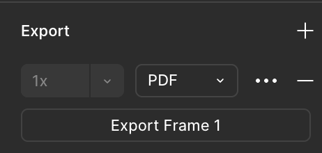
Export to PDF
In the Layout area on the right-hand side of the screen, select the main Frame to highlight the overall design.
Then, on the right-hand side of the screen, in the Design area, look at or scroll down to the bottom to reach the Export area. Click on the + to reveal the Export options, including the dropdown where you can select the format as PDF (or PNG, JPEG and SVG).
This will generate a file that you can print at 300dpi to produce an image of 85mm x 55mm as per the original requirement.
Should I really be posting things to a website like this while I’m still only just learning? Would it not be better to quietly practice in secret, offline, to get things just right, then burst on to the scene in a blaze of glory with the most whizz-bang website and all the bells and whistles to show off my skills?
Maybe so. That’s what I was thinking of doing, but the reality is that I learn best by doing, re-doing, refining and reflecting.
I can’t really learn how a blog, or indeed a website, works until I’ve got enough of a foundation to build upon, however shaky and unstable that may be.
My hope is that, as I get more experience and improve things, I can take the lessons and condense them down into concise, maybe even elegant, little references.
Unfortunately, for that to work, I need to learn the lessons first. And for that, I’m afraid I also need to make mistakes. So I’ve decided to give myself a break. I ask you to do the same.
Good question. I was just asking myself the very same thing.
To begin with, this is the blog section of the website of Martin Ashworth. The website as a whole is very much a work in progress and so I’m starting out by writing this as a way to gather my thoughts and catalogue my progress.
My hope is that, with time, I can also start to condense some of the things I learn into more useful resources that I can use for future reference and… well, who knows? Maybe someone else might find it useful. After all, what could be a better outcome for a first website?


